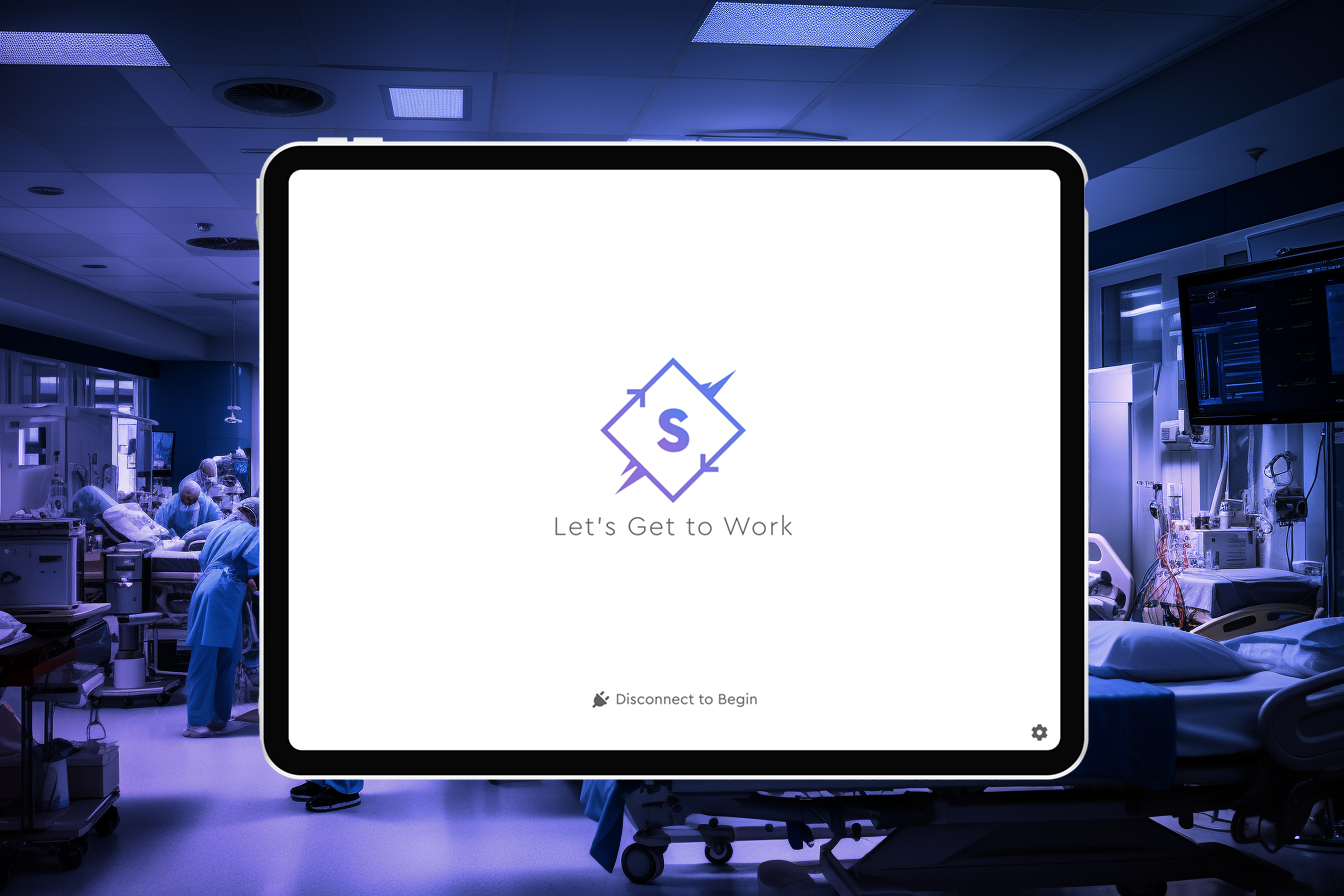
Dr. David Harris, an Associate Clinical Professor and Cardiovascular Specialist at University of Cincinnati Medical, approached UC’s Venture Lab to ask if they could help him create a prototype for an iPad app he had named Synchronize. His idea was to revolutionize the emergency room crash cart experience by recording activities performed on a patient digitally instead of on paper. Dr. Harris had already built a non-interactive prototype in Powerpoint, but wanted to create a more polished version to present to investors.
Steve Daly, a former CTO and boss of mine, was serving as an Entrepreneur-in-Residence for the Venture Lab. Steve’s experience told him he needed a designer to help Dr. Harris, and it happened that I was taking freelance clients.
Steve connected Dr. Harris and I and the three of us scoped out the project; a brand and clickable prototype meant for an investor presentation.
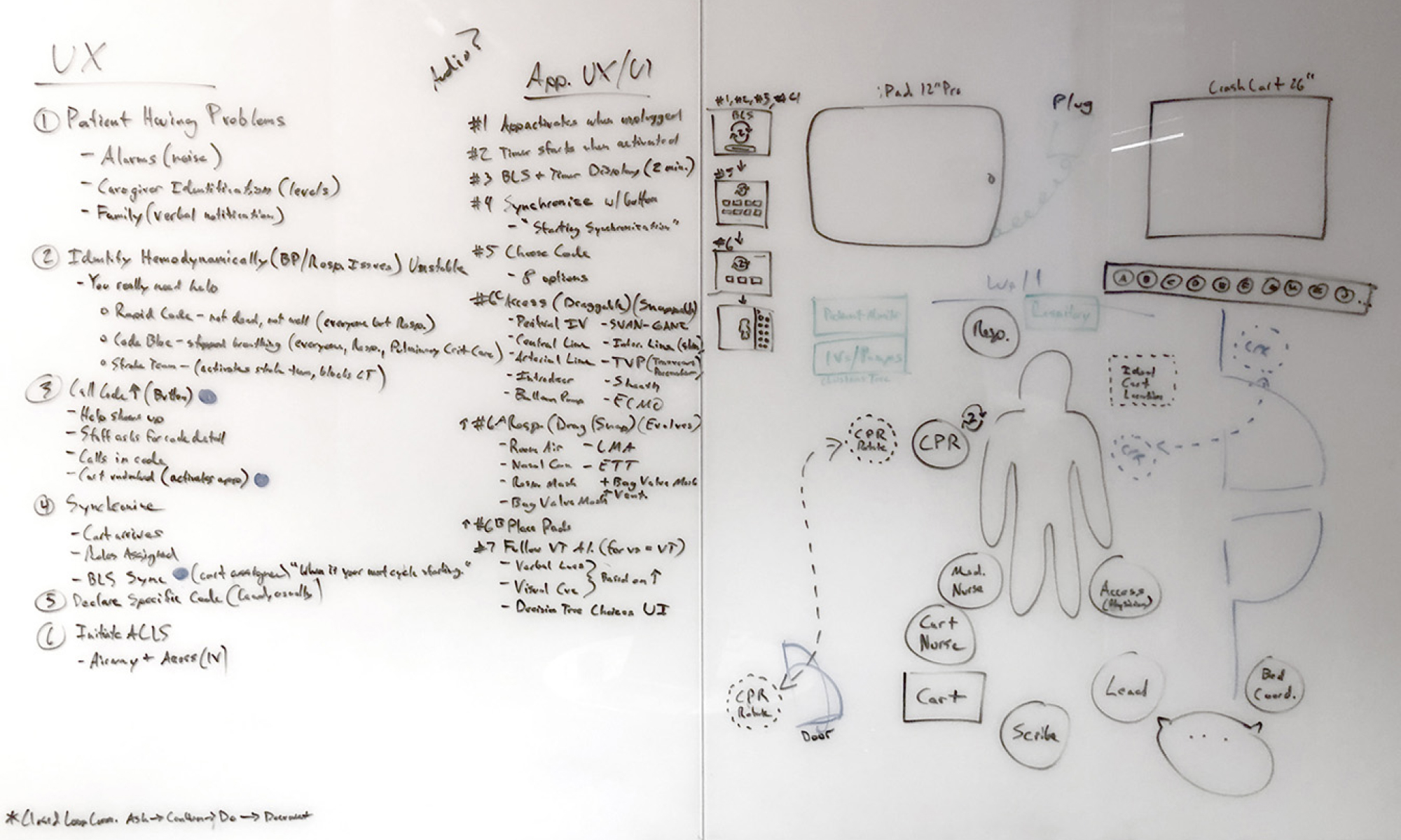
Dr. Harris and I met to workshop through feature prioritization using the MoSCoW Method. This worked well, but I quickly realized how little I knew about crash carts. Dr. Harris walked me through which doctors and nurses used them, which emergencies crash carts were specifically used for, where a crash cart sat in an emergency room, when CPR and other techniques and technologies were applied, and why it made sense to digitize the whole process.
After one final UX Brainstorming workshop, spanning two to three hours, I finally understood one of many ways to keep a human alive while suffering from cardiac arrest, in a hospital ER, using CPR, oxygen, a heart-monitor, defibrillator, IV drugs and electric shock. This was the final blueprint I needed to build the Synchronize prototype.
While sketches, wireframes and prototypes can go a long way to help stakeholders understand the context of a digital product, brand assets are required to make any project feel complete.
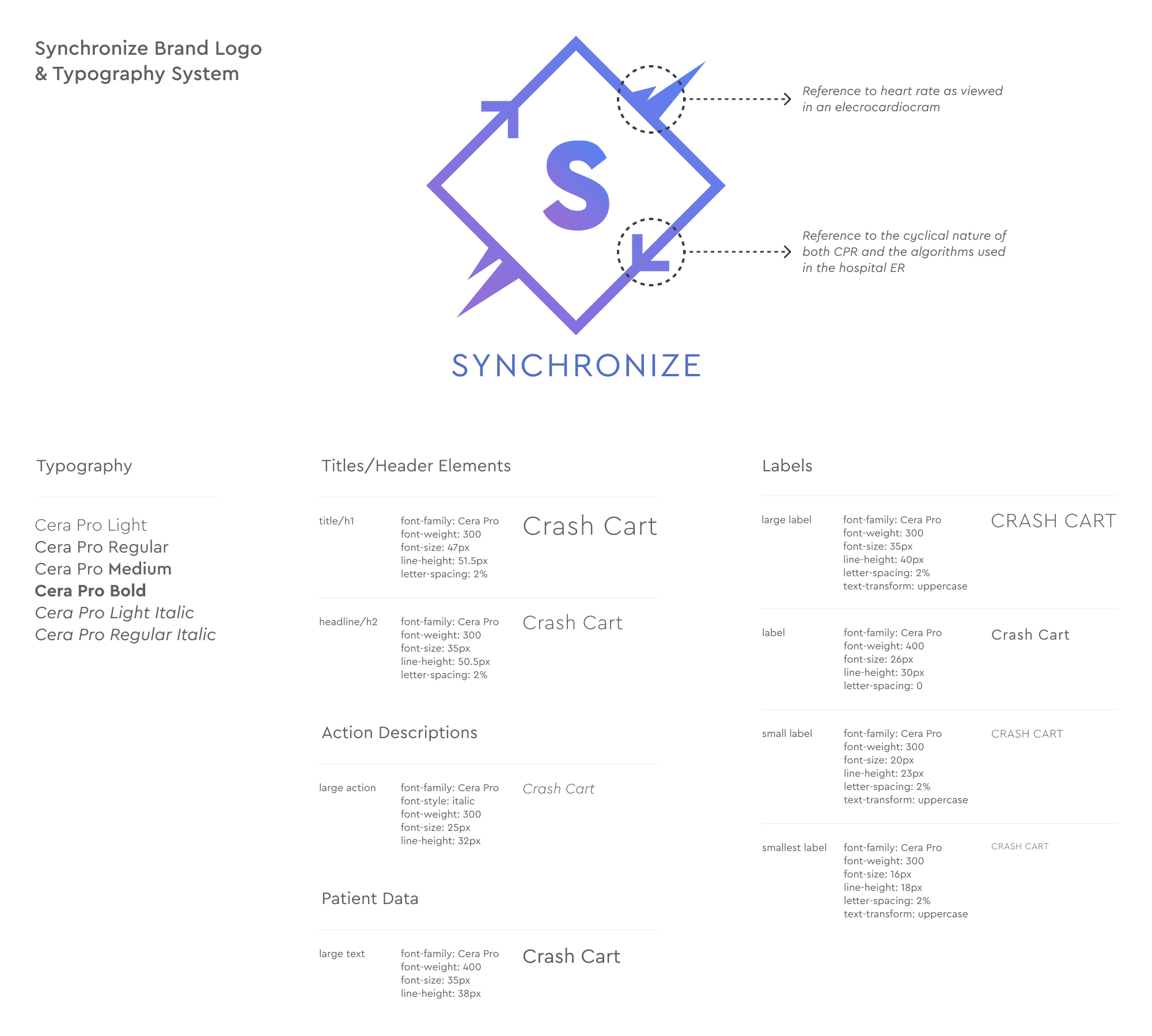
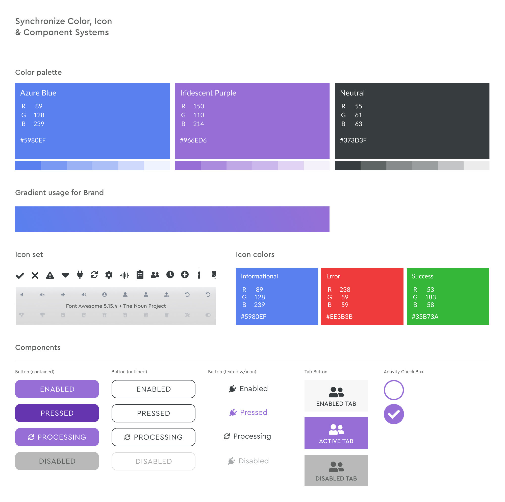
While the project brief didn’t allot many hours for branding, I wanted to make sure Synchronize looked appropriate for the healthcare business sector. Leading the way, Dr. Harris and I settled on a simple brand mark that could also work as an app icon. We decided on Cera Pro for its geometric letterforms, high, legible x-height, and plentiful styles and weights.
A colorful, intuitive UI can help users both navigate complex experiences and enjoy them. Dr. Harris was set on blue or purple, so we combined them to stand out from other healthcare solutions favoring blue and green palettes. For icons we used Font Awesome and a few medical specific icons from The Noun Project.
Using all of the brand assets created thus far, I created starter components, then added more as needed.
With brand assets approved, I moved into prototyping. At the time, in 2019, there were many software options for how to execute a clickable prototype. I tinkered with Sketch/Invision and Framer, but ultimately decided on Adobe XD as it allowed me the option to share links and gather feedback while also allowing for copy and pasting from other Adobe products.
The first pass at the clickable prototype was low-fidelity (LFP), which was more like a clickable wireframe, but it helped confirm the appropriate order of operation when trying to save someone’s life in the ER.
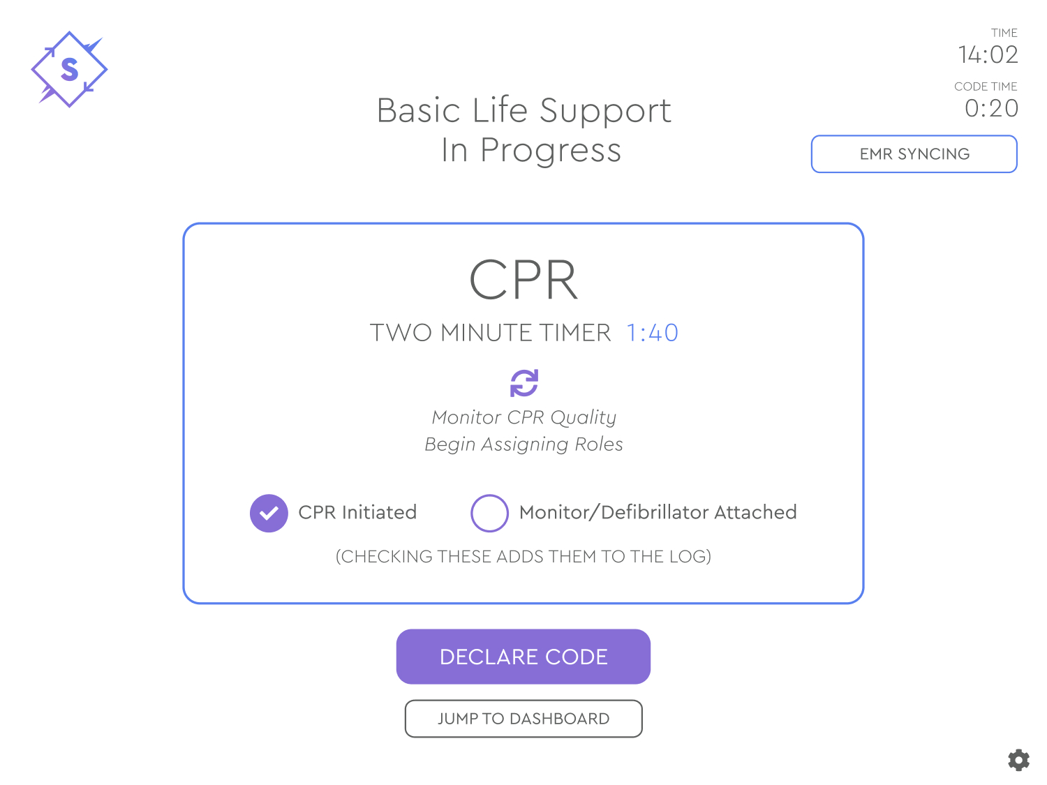
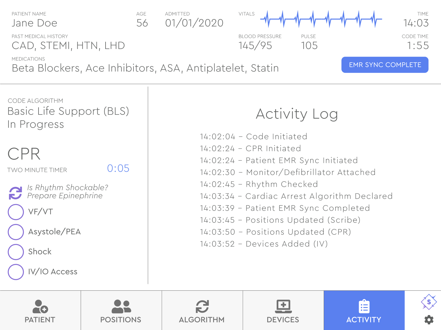
The final, high-fidelity prototype includes a Basic Life Support (BLS) section that checks key steps when starting a code in the ER. This interface is designed for one person in the ER in particular, the Scribe. As they retrieve the crash cart, they need to keep track of the total amount of time and note required procedures. All of this is built into Synchronize.
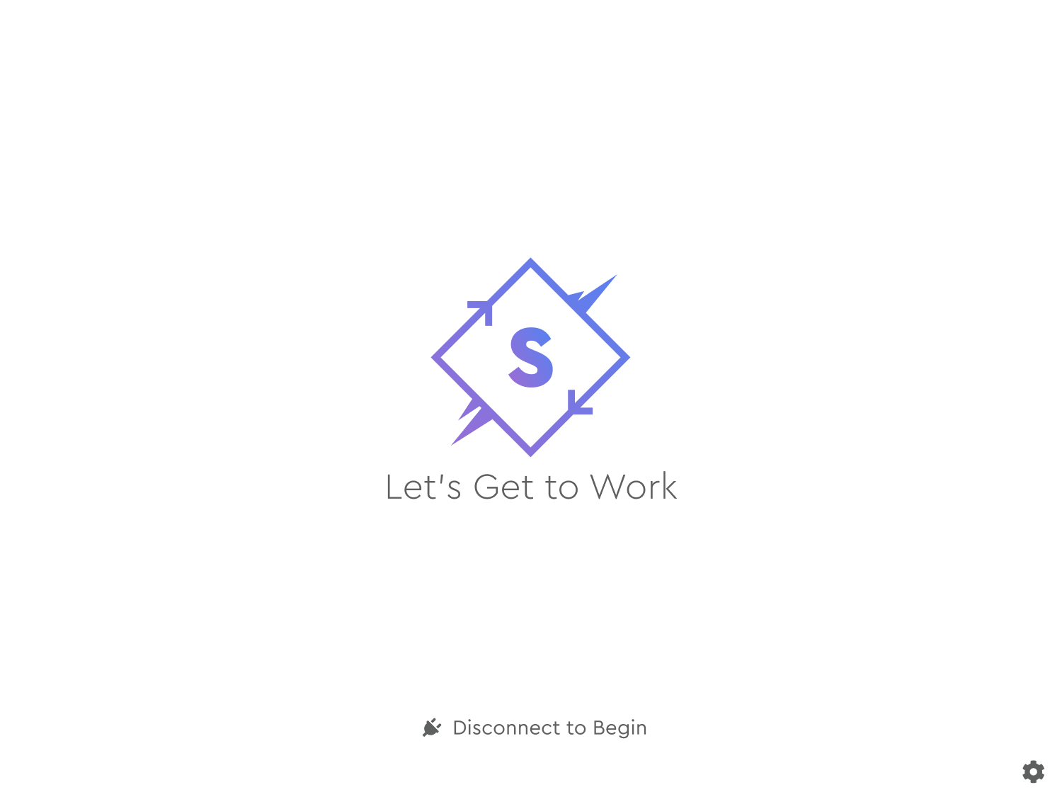
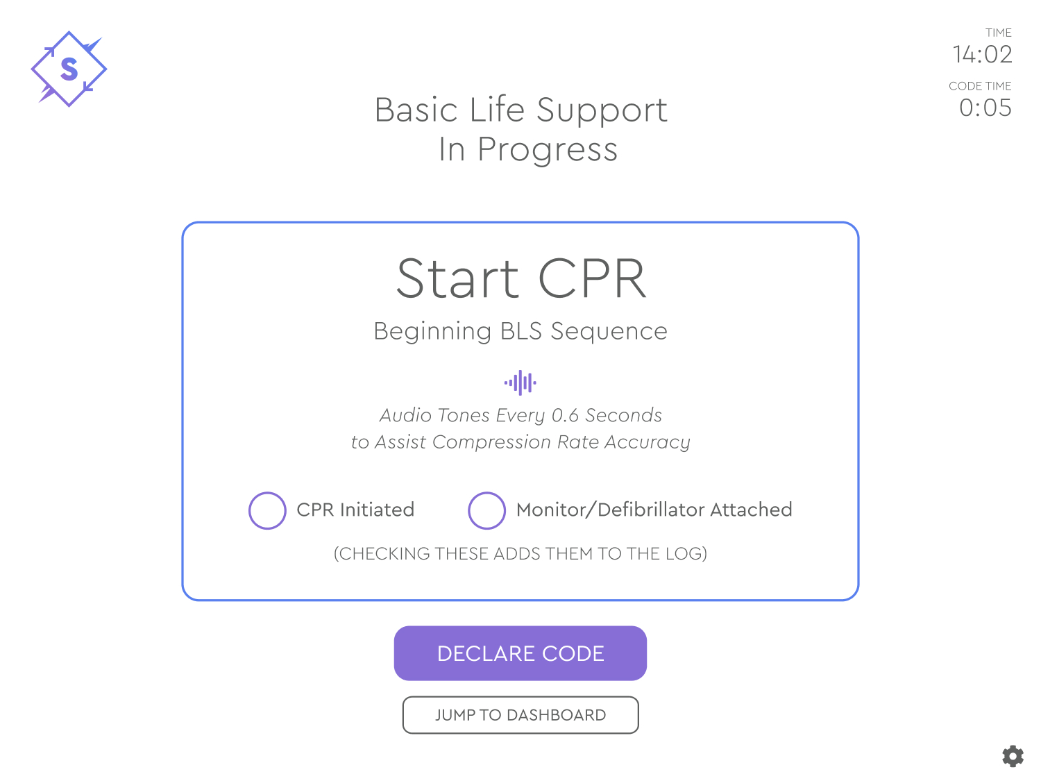
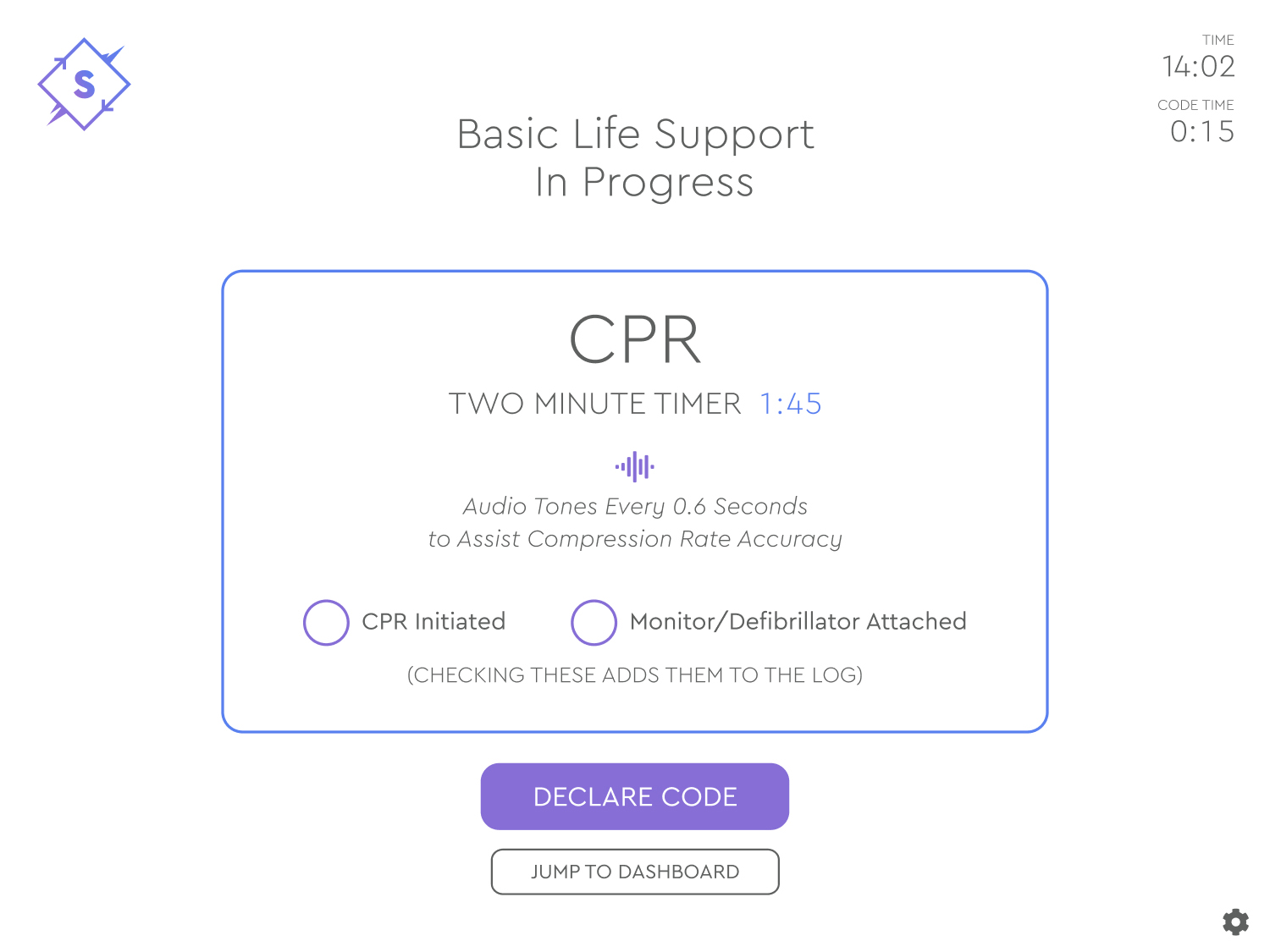
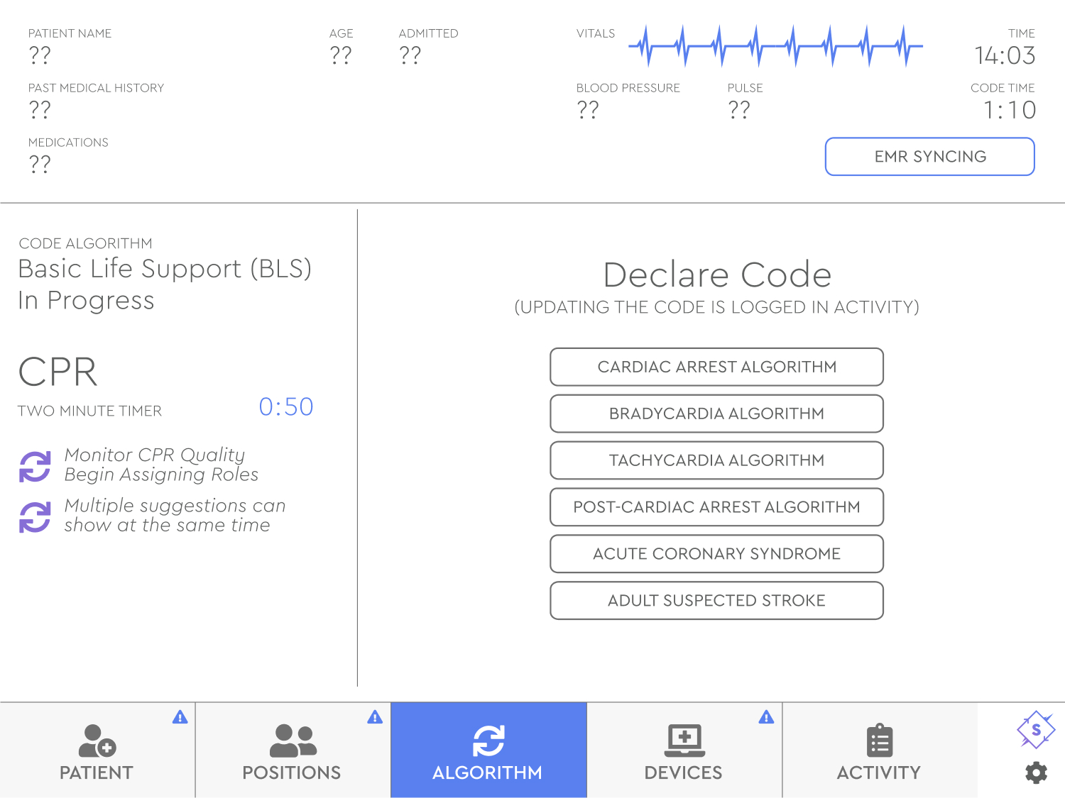
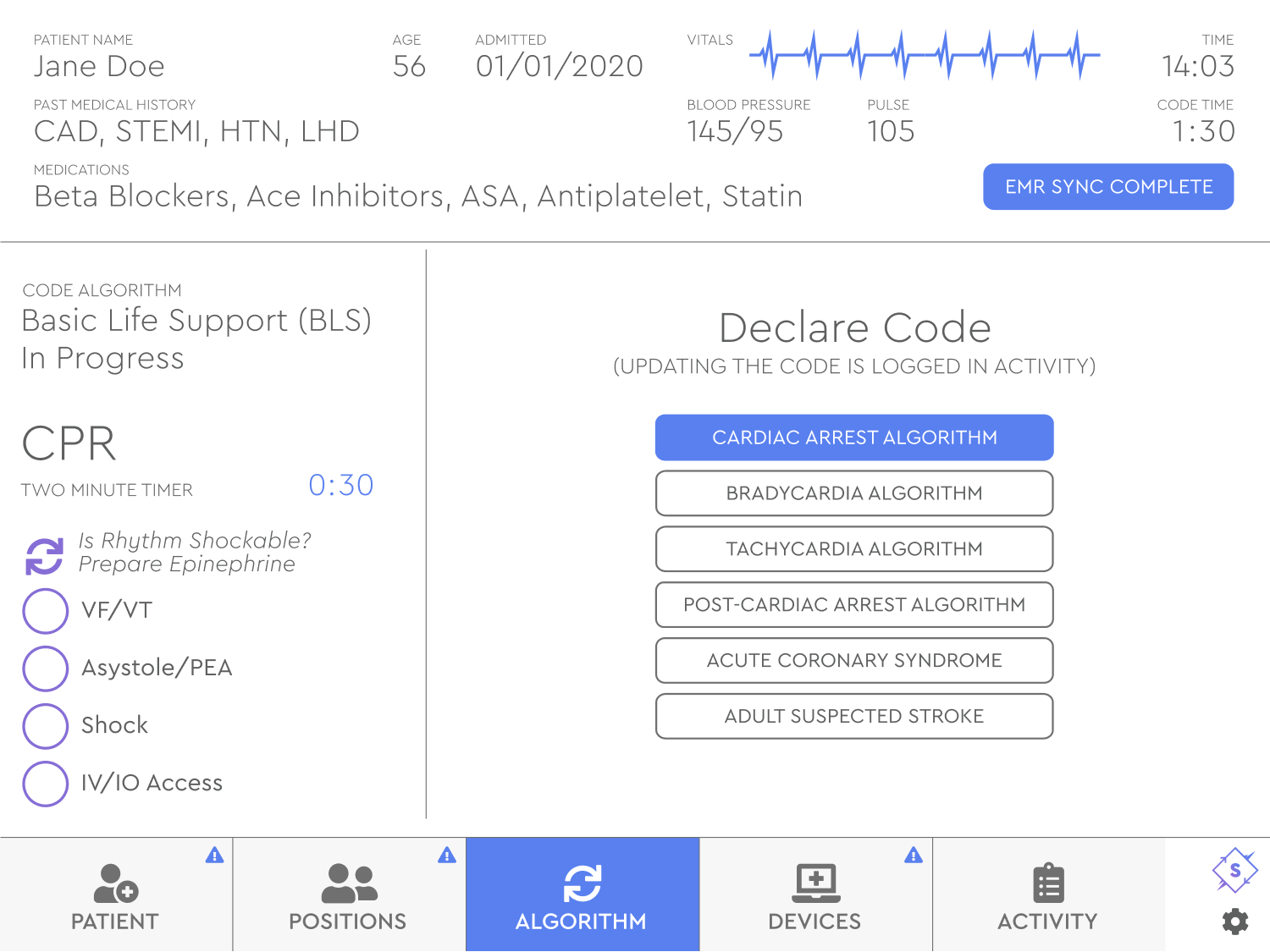
Once a medical code is decided the Scribe is sent to the app dashboard where they can choose a specific code, Cardiac Arrest in this instance, and manage other important data required for the emergency. They can even change the code, if needed.
We designed Synchronize to work with technology that did not exist in 2019, like syncing with local emergency medical records (EMR) and smart medical devices, but it was important to consider how the industry might look in five to ten years. We added manual entry for each of these sections too.
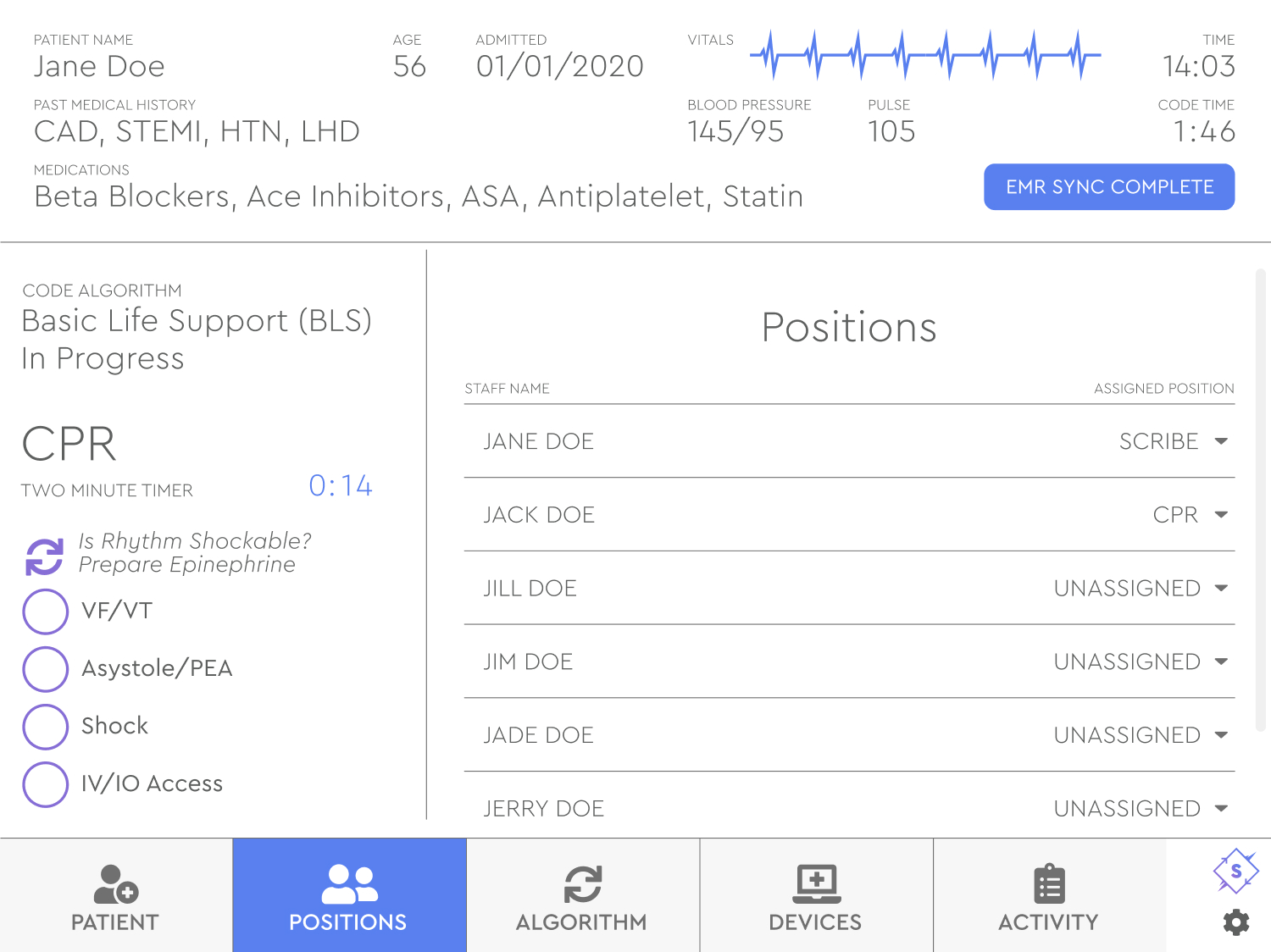
Synchronize was designed with tabs to support patient data, ER team positions, medical codes, medical devices and an activity log. The activity log was a major feature, useful for digitizing the entire experience immediately, which was better for family communication and insurance purposes.
Once the high-fidelity prototype was complete, I helped Dr. Harris work screens and copy into a pitch deck created by The Venture Lab. Dr. Harris went on to present Synchronize to investors in 2020.